Hi, I’m Luke, the Inclusive Graphic Designer at Purple Goat Agency. If you have ever wondered over the past two years why our colours have changed or who makes the covers for our Instagram reels – that’s me. I’m not usually the one getting involved in campaigns and Purple Goat’s end results, but a lot of what I do is seen and used around the whole agency every day. Today, I wanted to take you on a journey of everything that I have done over the past two years, as I’m sure that some of you are curious as to why we have made certain choices with our brand over this time. So sit back, relax, and enjoy as you learn about the Purple Goat brand!
The Start of My Inclusive Designer Journey
It was the summer of 2021. I had just left university a month before with awards, commendations and an incredibly strong degree. But I was completely burnt out on Graphic Design and telling myself I would never open Photoshop again. I wanted to move as far away from it as possible. With this in mind, I started a graduate role training in something completely different. However, this didn’t work out either and I ended up leaving after 2 weeks. It felt like nothing was going my way, and I had no idea what to do.
Fast forward 8 weeks, and I had been applying to numerous jobs with barely a single response. That’s when I saw an opportunity open up on LinkedIn for a Social Media Marketing Internship that I was more than qualified for. Looking over the job requirements, I pondered “I’ll have to go back to Graphic Design, is that something I really want to do?” But I applied anyway, because the agency was one I had been following for a while and truly believed in. That agency was Purple Goat Agency.
Let’s jump forward one final time to October 2021. I had started my position at Purple Goat Agency, designing social media assets for clients. At university I had written my dissertation on Inclusive Graphic Design, an area I thought I would never explore again after graduating. People barely even talk about it, so why would someone want to hire me for that? But here I was, using my knowledge of Inclusive Design principles to guide companies and make their social media more accessible. I was happy, I was being creative, but most importantly, I wanted to design again.
It became very apparent to my line manager Dom Hyams that I was a talented designer after he let me work on some of the client pitch decks. On completing my internship, both Dom and Martyn Sibley asked me if I wanted to stay as Purple Goat’s first Junior Designer. With my passion for Graphic Design rekindled, I jumped at the opportunity. But I didn’t want to just be a Graphic Designer – I wanted to be an Inclusive Graphic Designer. I knew that this was the only place where I could truly explore Inclusive Graphic Design and teach it to others. So from that point, I made it my mission: I would lead Graphic Design into a new era where Inclusive and Accessible Design principles are not separate, but are fully intertwined with the discipline.
Nearly two years later, and I am still here. With introductions out of the way, we now move onto the important stuff – the branding. How, and why, has Purple Goat’s branding changed? I’ll also talk about how this relates to Inclusive Graphic Design too, and what I have learnt about it in that time.
Definition: Inclusive Graphic Design
Before we start, it’s important for me to define specifically what Inclusive Graphic Design is. I’ll probably go into more detail about this in a later article, so I’ll keep it brief. Essentially, I make graphics that are legible and perceivable to the disabled community. This means that when I am designing graphics, I am paying close attention to features such as typography and colour contrast, ensuring that they follow current guidelines on what is considered accessible to the disabled community.
To me, this area is particularly interesting because Graphic Design is also a form of visual culture (‘art’ that is not ‘fine art’). Current guidelines on inclusive and accessible design focus more towards web and product design, which are not as embedded within art. As they are more removed from art as a whole, it is easier to prioritise ‘function over form,’ to ensure that the end product is usable first. However, as Graphic Design is a form of visual culture, aesthetics are more closely intertwined into the heart of the discipline. This means that as opposed to product and web design, an Inclusive Graphic Designer must learn to strike a balance between form and function that creates beautiful, yet accessible, design. However, these guidelines have not yet been established, which is a lot of what my work tries to resolve.
How Purple Goat Was When I Started:
The first time I started creating assets for Purple Goat, I was surprised at how little we had. Our brand guidelines were about 2 lines on a Google Doc stating our typefaces and colour hex codes. We also had a logo. That was it. I knew that if we wanted to develop as a brand and create more amazing pitch decks, we would need more. However, up until that point, nobody had focused much on design – Purple Goat never had their own Designer before. So I knew it was my responsibility to change things.
Some of you reading this may remember our original purple colour. This was fine, it was reasonably accessible. However, it was quite dull, and it was the only colour we had, always paired with white text. For creating assets, this was incredibly rigid and made it incredibly difficult to make different assets stand out from each other. We needed a wider colour palette which could give us more combinations.
Our main typeface was Oswald with Open Sans for body copy. The reason we used this combination was because it was the one our sister agency, Goat, was using at the time. Open Sans is an excellent typeface because it has all the characteristics of an accessible typeface, and looks very strong too. As our two agencies grew though, it became clear that we had to move away from using Oswald as the use cases that Goat were using it for were different from our own, and we needed a title font that suited our purposes better.

Finally, we have the Purple Goat logo. The most consistent and widely recognised piece of Purple Goat branding. From the beginning, I have loved the Purple Goat logo. It was very well illustrated and easy to work with. I knew that there was so much more we could be doing with this. In fact, one of the first assets I ever made at Purple Goat was a purple background with our logo tiled on it. For the first time, we had something a bit more visually complex and aesthetically pleasing that could make our assets look a bit more bespoke. This started a trend that would continue for the next two years.

The Changes I Made Over the Next Two Years
Expanding Our Colour Palette
One thing that was very clear to me from the early days was that we needed more shades of purple. A single hue just wasn’t enough to create a wide range of assets. So I chose our next two shades of purple to use and replace the original purple. The idea was that these were a bit more saturated than the original to make the brand look a bit more contemporary. They also had excellent contrast against each other, so for the first time ever, we could have purple text on a purple background and have it be accessible!

Over my two years, I have worked with a number of different brands and styles, and one thing I have learnt is that desaturated midtones are some of the hardest colours to work with when it comes to Inclusive Graphic Design, because the colour contrast ratio is always fairly similar against lighter and darker colours, so it is never high for either.
While these colours were working well, we introduced a third tone after a while longer. The reason for this was that I wanted a tone that was much more saturated, so we had one ‘standout’ colour. It isn’t accessible against white, but the trade off is that we have a colour we can use to make our assets look more vivid – who says Inclusive Graphic Design has to be boring?

Backgrounds and Styles
Over the past 2 years, we have gone through a lot of different styles including sticker, textured, cut-out, black and white, full colour and many more. I believe it is important to work with things to test their limits, especially when it comes to design. Styles that have stayed have endured because they are flexible and easy to produce. Styles that were time consuming (like rough edges) or that didn’t quite work at all sizes (like the stickers) were retired simply because they didn’t work or meet the wide range of use cases that we require. This has led us to where we are now, which utilises noise, cut out images and solid drop shadows. I believe that this is the best place our brand has been yet because of its flexibility and bespoke nature.
A New Typeface
Eventually, we changed Oswald for a different typeface – Raleway. I chose this typeface for several reasons:
- As a sans serif typeface, it is more accessible than others.
- It works well in both all caps and title cases.
- The most important reason of all: it was available on Google Drive!
That third reason sounds ridiculous, but let me explain. One of the most important lessons I have learnt about branding in an organisation is that everyone needs to be able to access all aspects of the brand’s visual identity. You may be working with departments and co-workers who don’t have the same software as you but who need to make presentations and other assets in your branding.
This made Raleway an ideal pick because everyone knows where to find it all the time. One of my main goals when making internal brand assets is that even someone with no knowledge of design should be able to know what the basic assets are and where to find them. Design can sometimes be intimidating to ‘non-designers,’ especially if your brand has a lot of rules and requirements. I am (arguably too) relaxed when it comes to how people use our colours and typefaces, but this is because I want everyone to feel empowered to design and be able to contribute without doubting whether they have got everything right or wrong.

The Text Logo
Some of you may have noticed recently that we have introduced a text logo alongside our main illustrated one. This logo is not to replace the original, but to work in situations where the goat head doesn’t quite fit. Having both a portrait and a landscape logo has helped us massively to become more flexible, particularly when it comes to pitch deck design.

Photo Imagery
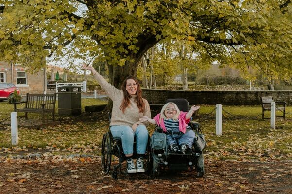
This brings us to the latest hurdle I am currently overcoming in Purple Goat – the way we use photo imagery. Photos are important because they are more natural and relatable than digital graphics, so they are very important. However, tracking down authentic, high-quality images of disabled people is very challenging.
Many of the images that I find do not consider intersectionality at all, they are often of white, young people. Representation of disabilities is also an issue, with overrepresentation of some disabilities and barely any representation of others. On top of this, disabled people in photos are often portrayed in specific ways compared to non-disabled people. If you type ‘people drinking’ into Adobe Stock, and then type ‘disabled people drinking’ straight afterwards, the results that the library gives you are incredibly different. This is an extension of how society views certain experiences of disabled people and how non-disabled people may view disabled people as ‘different,’ (which we know isn’t true – disabled people can and do drink alcohol if they choose to, the same as non-disabled people!). Then, when you do find a good image, the caption or tag accompanying the image can often use language that is either highly ableist or ascribes to the Medical Model of Disability.
This is definitely an issue that extends way beyond Purple Goat and into representation in the media as a whole. There is a lot that needs to be addressed here, and I am currently trying to see how we can overcome this to have more inclusive and representative images.


What I Have Learnt At 2 Years of Purple Goat
Over my 2 years at Purple Goat, I have learnt a lot of lessons about Inclusive Graphic Design. Some of them are things that I have learnt personally, while others are things that I have noticed in the wider industry that need to change. Here are my top takeaways:
- We still have a long way to go in harmonising Graphic Design and Inclusive Design: I personally still do not see a lot of conversation or acknowledgement from major design bodies about the importance of Inclusive Design principles in Graphic Design. I think it would be amazing for organisations such as D&AD and AIGA to speak more openly about this to bring attention specifically to the design industry.
- Large design organisations need to put Inclusive Design further at the forefront and stop paywalling accessibility features: Here I am referring specifically to Adobe software but it does not end here. Design software needs to allow users to consider and utilise Inclusive Design principles so people can implement this themselves. Adobe InDesign does have features that enable people to make accessible PDFs, but these are unintuitive and difficult to use. Adobe Acrobat is even less intuitive and its accessibility features have bugs. On top of this, you can only run an accessibility check in Acrobat Pro. I believe that nobody should have to pay for accessibility features, especially if a free version of the software is available, otherwise this is ableism.
- There is a gap in long-form literature surrounding Graphic and Inclusive Design: As far as I can see, nobody has yet written a book on Inclusive Graphic Design. Maybe this is something I should look into doing myself?
- Designers need to empower everyone in the business to be able to use brand assets: As previously stated, everyone in your business needs to be able to easily find and access all elements of the core brand guidelines, from colours to typefaces. Non-designers need to be given the freedom to create work without feeling that they are going to do something wrong or will need to make several design revisions.
- I’m not a perfect Inclusive Designer – but I’m always learning! This is a discipline that is in the process of being crafted and so there is always more to learn. Even though I wrote my whole dissertation on this topic, I am still learning and revising my opinions on certain aspects on what makes a piece of design inclusive. I hope that like with Web Design Principles, we will one day be able to put into writing what designers can do to be fully accessible.
Conclusion
I hope that this has given you a good insight into the Purple Goat brand and why we have made some of the decisions that we have made. The past two years have been an amazing learning experience for me and I can’t wait to see where our brand goes next.
In terms of the next few years, there is still so much more that I want to achieve. I have spoken above about improvements to inclusive imagery, but I believe that the next step is also to bring our learnings to the wider Graphic Design industry and start to educate others on Inclusive Graphic Design. Whether that be through public speaking, writing or otherwise, there is still so much more that we can do to improve awareness and usage.
If you are a business looking to improve your own brand or create your own inclusive assets, then we at Purple Goat can help. If you fill out the contact form and we will be in contact to discuss this further.
Until next time, thank-you for reading!


