Introduction
I think that in the past few weeks, I’ve probably opened Threads as many times as I’ve opened Twitter ever. If you’re unsure what Threads is, it’s Meta’s new social media app to rival Twitter, offering incredibly similar UI and functions. Released on 6th July 2023, Threads catapulted itself into the social media world, boasting over 100 million users in 5 days. Its aim being to start public conversations and allow people to post quick thoughts, and Mark Zuckerberg says that the focus is “on kindness and making this a friendly place.”
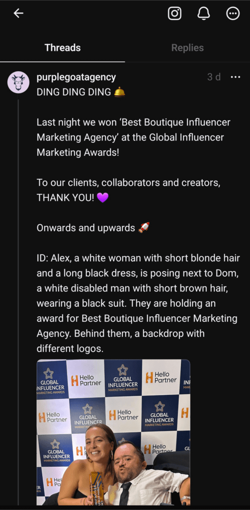
However, not everyone has been happy with the launch of this new phenomenon. In the morning of the launch, I was already seeing accessibility experts in my LinkedIn feed discussing the lack of accessibility features that the app has. As I listened to people, and downloaded the app myself, it became apparent that this app was certainly not perfect. If you’re interested, I even recorded my live reaction to opening the app for the first time for Purple Goat’s social media.
Despite this, I have now had time to think, have conversations and read the opinions of accessibility experts. Originally when I wrote this article, I wanted to have the flow be three accessibility features that were present, as well as three that were missing. However, as I learnt more about this app, I was having to put an asterisk next to every single feature as it appears that the accessibility features that are present are incomplete. So instead, I have written three accessibility features that are present, and how they can be improved, alongside three accessibility features that are entirely missing.
Threads Accessibility Features and How To Improve Them
1: Screen Reader and Text-to-Speech Compatibility
Early indications show that Threads is compatible with certain types of accessibility software, particularly those used by the visually impaired community. Lucy Edwards posted a video on social media very early on demonstrating how the app worked with both a screen reader and a text-to-speech tool that she used. When I originally wrote this article, I couldn’t find anything to the contrary. However, through more research, one thing that I discovered was that despite what I originally saw, Threads does have an illogical reading order on its posts. This means that for screen reader users navigating the app, the software may move between seemingly random pieces of information, when in fact the problem lies with the app.
To end on a positive note though, Lucy has been very positive about the accessibility of the app, and even has communication with members of the team who can add more features in. That may mean that others in the community who have had a different experience to her may be able to get their concerns voiced through her. Thumbs up to Meta too for including disabled people in conversations around the development of the app!
2: Compatibility with Dark Mode
The popular accessibility feature, used by both disabled and non-disabled people, works on Threads! So where is the problem? It is that while I could activate dark mode from the settings of my phone, and it carried over, dark mode cannot be toggled directly within the app itself.
This is an issue not just for dark mode, but for a number of accessibility features that would be better if they could be activated directly within the app itself. Instagram and Facebook both allow users to have control over some of the accessibility features that can be activated, so Threads should have this too.


3: Accessibility of Feed UI
On opening the app, you are instantly met with the feed of content from lots of different accounts. In terms of displaying the information, Threads does a reasonably good job of using inclusive design principles. The text is written in a black, sans serif font on a white background. Pretty good. The buttons are a bit smaller than Instagram’s, and could do with some improvement, but at least they are certainly much better than some of TikTok’s buttons. Hierarchy between account names and the post is also good, I can easily tell which is which.

However, I think some improvements still need to be made here. Some of the secondary information, such as post time, number of replies and navigation buttons, use a mid-grey on a white background. When I ran a test by taking the hex code from one of the buttons and running it against white on a colour contrast checker, and the ratio came out at 1.85:1, which isn’t even close to passing minimum accessibility standards. Other people who ran this test found similar results. In addition, other problems that other users have encountered include a lack of compatibility for larger screens and unable to view the app in landscape mode on mobile.
Where Threads Fails in Accessibility
1: No Option to Add Alt Text to Images
Despite some of the present features shown above, Threads is still missing one of the most important and fundamental accessibility features. I have seen some users adding image descriptions to their posts, which should be included anyway, but these should be in addition to alt text, not instead.
Meta has AI technology that can automatically generate alt text, but like most functions designed to do this, it often writes incomplete or unhelpful descriptions. For instance, an example shown in this article gets the alt text of “May be an image of text.” Every piece of text on a graphic needs to be written out for a screen reader, so the fact that the AI isn’t even sure there is text, when there is a lot of it, shows a need for improvement.
I have heard some suggestions that alt text is being added into Threads, or is in Threads, but on the day of writing this (24/07/23), I have tried to add alt text to a Thread without success. So if it is there, it certainly isn’t clear how to add it. Hopefully when it is fully rolled out, it will be very obvious how to add it.
2: No Custom Captions on Videos
Closed captions are another accessibility feature that most people, disabled or non-disabled, utilise often. When I first wrote this article, I was under the impression that there were no closed captions in Threads altogether, until I read this article. It turns out that auto-generated captions are in the app, but the user has to toggle whether they want captions on videos shown rather than adding auto-generated captions to the video when uploading it. I found this feature after tapping through several menus, where the ‘Captions’ feature was hidden near other settings such as ‘Avatar’ and ‘Browser settings.’ On a quick scan, it would be very easy to miss this, as I did.
My first problem with this is how it would interact with a Thread from someone who has added custom captions to their video. On other platforms, such as LinkedIn, I would probably turn off auto-generated captions if I have added custom captions to a video. This means that only one set of captions would display on the screen at once. However, on Threads, I as the creator have seemingly no control over this. For the captions user who has turned on the captions function, my video would actually be more inaccessible because there is a high chance that my custom captions would crash into the auto captions. I think that the creator should be able to control this, where auto captions are enabled by default with the option to turn them off if custom captions have been applied.
Also, to me, their lack of inclusion from a disability perspective isn’t the only accessibility problem here. Something else I believe quite strongly in is the accessibility of software and its impact on inclusive design. In this case, Threads not letting people customise captions for their videos means that someone who wants to ensure they have accurate captions on their video must use another tool before they are able to post. We cannot expect people to have access to additional tools to write this, for both monetary and technological reasons.

3: No Web Version of the App
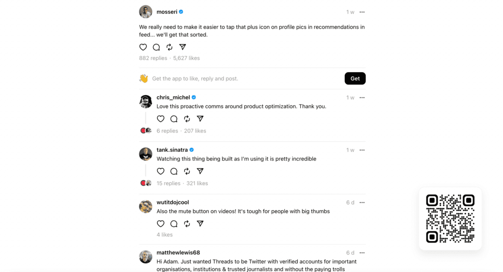
Currently, Threads does not have a web version of its app. You are able to send people URL’s that allow them to view specific Threads on the web, but there is no way to then log in and see more. Instead, there is just a QR code in the bottom right corner that prompts the user to download the app on their phone.
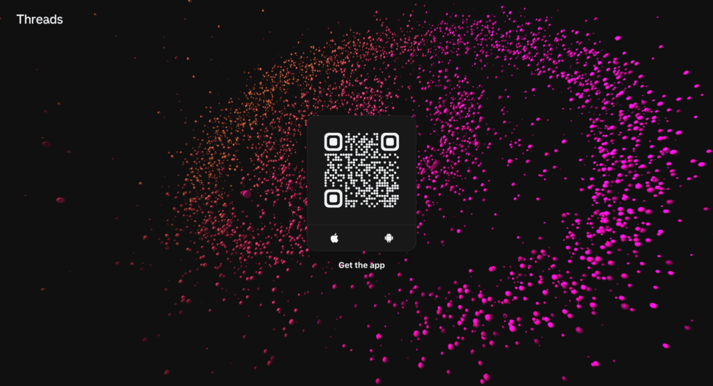
This is a similar layout for the app’s website, which is just a moving 3D graphic with a QR code in the centre. As I saw one person point out, there is a further accessibility problem on the website too as there is no way to stop this moving graphic. Web users should always be given the option to pause moving graphics and videos on websites.
I also found this website confusing as it doesn’t tell the user what Threads is or give any further information about it. If I were someone who wanted to download Threads but wanted to learn more, I would find this website confusing. I expected a prompt to appear or some other form of interaction, but nothing ever showed up.

What Does This Mean for Disabled Users?
For disabled users deciding whether or not they want to download this app, it depends entirely on assistive technology requirements as to whether or not you can use this app. As an Autistic person with no assistive technology requirements, I personally have no trouble navigating this app. However, that is just my lived experience and I could imagine that a large proportion of the disabled community would struggle to navigate this app.
How Can Businesses and Users Make Their Threads More Accessible?
For businesses and individuals looking to make their Threads more accessible, there are limited options. Personally, I would avoid videos until captions are better implemented. When using images, make sure to add an image description to the Thread in the same way that you would with any other social media platform. Aside from this, there isn’t much that the user has control over with the exception of standard considerations such as colours and fonts on images, using plain English and similar.
Is Meta Likely to Make Changes to Make the App More Accessible?
To end on a positive note, it does appear that the developers of Threads are looking for feedback and are aware that the app does need more features in other areas too. Mosseri, the head of Instagram, has shown so far that he likes to have an open dialogue on the app. We’ve even seen some acknowledgement from him about increasing the size of some of the buttons. So I’m hopeful that this means that more accessibility features are coming soon.
Whether this is too late or not is also a point of discussion. Some sources are already reporting that Threads is seeing a large reduction in the number of its daily users. If Threads wants to keep people on the platform, then they need to better engage their users, including the disabled community.
Concluding Thoughts on Threads Accessibility
So where does this leave Threads’ accessibility overall? I would judge that while some consideration has been given to inclusive design on this app, it is overall lacking and in need of improvement.
At Purple Goat, we can offer insights to businesses to make sure that products and services are inclusive to the disabled community. Whether that be through roundtables or surveys, we can help you connect to the disabled community and gain the lived experience of a diverse range of individuals. We can also offer advice on making your social media more accessible, as well as providing Social Media Management for you.


